Evaluation of Training Sessions to Increase the Use of Statistical Process Control Charts in NHS Hospitals.
Background
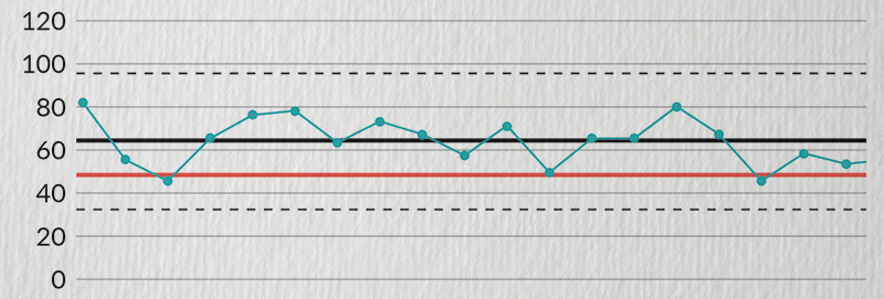
In 2017, our review of hospital documents (Schimdtke, et al. BMJ Qual Saf. 2017; 26: 61-9) highlighted an important issue: that unclear presentation of patient data was hindering effective decision-making in care. NIHR ARC West Midlands engaged with NHS Improvement, and specifically with Sam Riley who directed the ‘Making Data Count’ initiative launched by NHS England. This initiative trains hospital staff to use Statistical Process Control (SPC) charts for clearer data presentation.
We aimed to evaluate the impact of the training sessions within a number of NHS hospitals based on the inclusion of SPC charts in hospital board papers, and through trainee feedback.
What Did We Do?
The training programme effectively increased the usage of SPC charts in NHS hospitals, as demonstrated in our original research article published in 2023 (Kudrna, et al. BMJ Qual Saf. 2023; 32: 100-8). Our subsequent evaluation (Schmidtke, et al. BMJ Qual Saf. 2024), further indicated that contextual elements, such as a social media campaign, likely influenced the training’s impact.
We also co-created a video about the research with public contributors that is available on YouTube (youtu.be/YkctipI9IEo) and has been viewed over 600 times.
What Did We Learn?
Our evaluation showed that the uptake of SPC charts in NHS hospitals has improved over time, and the process if becoming a new standard of reporting for hospital trusts. Thanks to the Making Data Count training programme running in hospitals in England, many hospital boards are now phasing-out the traditional red-amber-green (RAG) reports and adopting SPCs.
What Next?
Recently, our publications were cited in training conducted in Australia for the Royal Australian College of Surgeons, who plan to adopt the SPC methodology. Clearer data improves decision-making, saves lives, and cuts the costs of providing care. This initiative exemplifies how improving data presentation can drive improvements in healthcare outcomes.
Key Papers
- Schmidtke KA, Poots AJ, Carpio J, et al. Considering chance in quality and safety performance measures: an analysis of performance reports by boards in English NHS trusts. BMJ Qual Saf. 2017; 26(1): 61-9. doi: 10.1136/bmjqs-2015-004967.
- Kudrna L, Bird P, Hemming K, et al. Retrospective evaluation of an intervention based on training sessions to increase the use of control charts in hospitals. BMJ Qual Saf. 2023; 32(2): 100-8. doi: 10.1136/bmjqs-2021-013514.
- Schmidtke KA, Kudrna L, Quinn L, et al. Cluster randomised evaluation of a training intervention to increase the use of statistical process control charts for hospitals in England: making data count. BMJ Qual Saf. 2024. doi: 10.1136/bmjqs-2024-017094.